
Tuesday, 27 November 2012
Monday, 26 November 2012
research file (object)
this is my research file for my object


this ruby will be housed in the butt of the duelling pistols grip and will re-enforce the fact that the pistol is used by people have power or allot of money

i will use the glow on the neon to give a future feel to my objects design.

i will use this power orb as reference for the power core of the duelling pistol.

i will use these duelling pistols as reference of scale.

grip reference
research file (character)
this is my research file for my character concept piece


i will take reference's from this black camo suit to get the shading and creases right on my character.

i will only be taking the shape of the scythe to create the characters four other defensive arms.

i will fuse the ballistic face mask above and the bug eyed mask below to create a much more intimidating mask which has the functions of both.

evaluation of concept art (object)
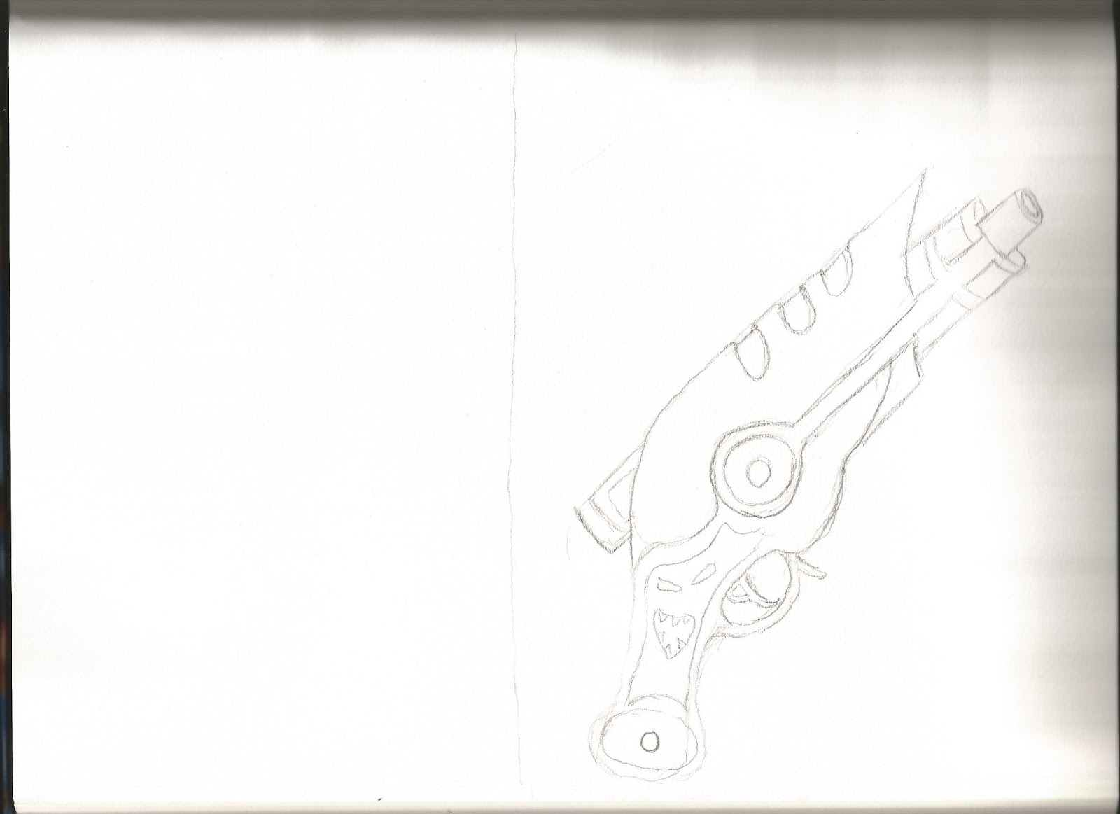
this is my evaluation of my concept art object which i have taken in inspiration from the steampunk styled gun below it, the design for my object is a reversed steampunk duelling pistole which was a challenge because duelling pistols stopped in the age of the musket, because of this i had to think of a reason why this weapon could only fire one shot instead of 12 to 15 like its modern day counter parts. the way i solved this problem is by making it a energy based weapon that needed to charge, i got this idea from a story i heard about the worlds first military laser weapon that could only fire one shot at a time and then takes 3 days to charge leaving the user defenceless.

gold plated:
the gold color is to represent wealth as duelling pistols are only handled by the wealthy, however designs of objects in the more modern age are more simplistic and therefore i have used a smooth rounded design with few but defining features, because if the futuristic style i have not covered the object with decoration like the image that inspired me.
the energy core:
the energy core is based on a fusion reactor similar to the ones you see in the films but on a smaller scale, you could also say it looks very much like plasm weapons that have been around in games from almost the start of computer games.
the guns base :
the base design follows the same layout as my inspiration (having the grip and trigger as far back as possible and having a long extended barrel) on the other hand ive changed the design making it more thick and armoured around the base of the barrel but still keeping the top of the barrel exposed.
rubys:
the ruby is there to show a sense of wealth even though allot of the fancy design has been removed this part of the object still shows that not everyone in the game can afford to have this weapon, it also shows that this weapon is more for show rather than a functional piece of equipment. this characteristic is present in my inspiration which also doesn't have a large amount of ammo, this would limit the weapons use in combat due to its low rate of fire.
style:
for this piece i have decided to limit my self to mainly using the gradient tool that we learned in the same lesson as this assignment was set and textures, the reason i gave my self these limitations is the same reason you would limit your self to two tones or colors which is its only a concept and not a fully rendered image or painting.

one thing i like about my piece is its unique cartoonist style even though this is not my main style of drawing this time ive looked outside the box and tryed something different and received a overall good result.
bad points:
the main bad point about my piece is the handle with i believe is under detailed and appears flat, the second point im not happy with is the jagged edges and curved caused by the polygon lasso tool however both problems could be fixed even on the final piece. i should have followed the inspiration more closely as a reference.
improvements:
one thing that i would improve if i were to do this object again would be the handle as i believe i could have added more detail onto it however at the time i was unable to think of any details i could add without messing up the overall design. another thing im not happy with is some of the sharp edges coursed by the polygon lasso tool, to fix this i would spend a greater amount of time masking the edges so they are more smooth and flow into each other better.
evaluation of concept art (character)
this is my self evaluation of my concept art for character design, in this report i will compare my finished piece against the piece that inspired it which was created by a professional concept artist. the profession artists piece was done for a game called metal gear solid and is entitled cyber ninja (the character is a robotic ninjas)

the face mask:
the face mask is based on two things, the first of which is a ballistic face mask that is designed to protect the users face from low caliber rounds. the ballistic face mask also strikes fear into the enemy this is the reason i chose it for the base of the face mask. the eyes of the mask as you can see have the same lay out as a spiders however the eyes them self are based the lenses from a Russian gas mask nicknamed the bug eyes.
the spider limb styled blades:
the blades that surround my character are based on the medevil scythes the reason i chose this design was for two main reasons the first reason in they look very mechanical and spider like which gives my character a robotic feel. the second reason is the scythe is the symbol for death and is most famously carried by the grim reaper the entertie that take you from this life to the next. not only is it the symbol of death the fact that they are overly side sharp blades similar to the cyber ninjas sword make them give off the same message.
my characters clothes:
my character clothes are based on special forces standard gear however because this character is going to just be a standard solider unlike the cyber which is one of a kind ive made his clothes look mass produced by reducing the complication of the design ( the bottoms have just got flaps for shin guards instead of having armor built into them and the knee guards are just strap on ones instead of having them woven into the trousers)

good points:
the first thing that i am most proud of about my piece is the scale, scale and proportions of object and characters is not one of my strengths however in this case after allot of trail and error i got the character in the right prospective and in the right proportions. the second part of the image that i am proud of is the light shading on one side to give the character a 3d feel similar to the shading on the cyber ninja.
bad points:
one of the main bad points about my piece is the feeling it gives off as even though the mask and outfit its self is quite intimidating the hands of the figure are to close to his crest giving off the impression that he is being defensive and not aggressive, as you can see with the cyber ninja his body is more spread out giving a feeling of dominance and power.
improvements:
if i were to redo or remaster my character to improve it i would put him in a more dominant stance with his arms further forward to show that he is character not to be taken lightly within a game.
Saturday, 24 November 2012
6 credit card sketches and refined sketch(object)
these are my six credit card sketches for my object piece.

i have decided to make my object a futuristic duelling pistol, i started by taking a standard duelling pistol with a noise enhancer and magazine but i though this was not modifying the base design enough. in my second design i based the pistol around modern person protection machine pistols but again i thought this wasn't taking the design far enough. finally by my third attempt i started using more modern curves in my design and i continued to do so until the last sketch where i based the design on a double barrelled shot gun.
threw out the sketches i made many different alterations to the design of the firing mechanism going from a simple flint system, then a clock and finally a energy core.
this is my refined sketch i took elements from sketches 4 5 and 6 and refined them to show more detail and implement them more effectively.
Friday, 23 November 2012
research file for (environment piece)
this is my research file of objects that i used as reference for my final piece, these objects include (a head of company ceo styled leather chair, flames, a old styled wooden table and finally the watcher a creature that watchs you in rem sleep.

evil genius/ ceo styled chair


old varnished table as the main center piece of the room
6 credit card sketches and refined A3

image one:
i have drawing the first credit card sketch very basic with very little detail and low shading however i have taken stance from a reference so the proportion is correct.
for the second image i have take most of my inspiration from the first sketch but i added more detail and shading giving the character a more 3D feel.for images 3,4 and 5 the design stays very much the same however i change the characters body type to alter the characteristics of how the character would be played. finally i completely changed the character to show him as only a shadowy figure similar to a phantom.

Wednesday, 21 November 2012

evaluation of my environmental piece
this is the comparison between my work and the work that inspired me.

the piece of art above is my final piece for environmental concept art, i have used two color tones to shade my work (red and green) to give it a very depressing ghostly feel as it represents a office looking threw the eyes of a mad man/woman or someone who has seen some things that have mentally effected there vision of the world. the way i have achieved this is by keeping the lines light and the shadows strong.
first i draw the basic sketch lightly on a A4 page in my sketch book, once i was happy with the overall design i took a HD image with my camera from a distance so that my shadow would not obstruct the sketch.
once i had the sketch in photoshop i changed the base tone to a dark green to start the ghostly claustrophobic feeling.
the fire:
the first is not behind glass it is mearly behind a steel Gothic styled grid allowing it to rage and flicker into the room giving a sense of danger as there really is nothing to stop it setting the whole room ablaze, it is also the only light sauce in the room and because of this some disturbing shadows are formed on the desk but the person has to move closer or else they have to face what is in the darkness.
the face in the mirror:
i based the face in the mirror on a story i once heard about rem sleep, the story goes when you are in rem sleep there is a shadowy figure watching over you and if you look into a mirror while trying to escape him your soul will be ripped from your body and you will become the shadowy watcher(the shadowy watcher is describe as a shadow of a man with small red eyes and a disturbing smile.
the shadow on the table:
the shadow on the table is coursed by the untamed light of the fire and is in the shape of man with holes where his eyes are suppose to be, this is to show that the man who sits in this chair is turning a blind eye to all the messed up things that are going on around him and in doing so has made him self unnoticeable this is why there is figure of him in the chair.
the hand, the monster in the bin and the eyes in the desk:
these three parts of the image are to show the onlookers inner demons for example the hand represents the persons desire to escape by he cant, the eyes are his/ her feeling of always being watched and the demon in the bin shows they are scared of disposing of any of there past.

good points:
even through my piece is not as detailed as this artists work i believe that mine follows the same sketchy like style as you can see on this piece the objects them self have very little detail but the artist makes up for this by the high quality style, i think that my piece shows exactly what i what the viewer to see which is a world seen through the eyes of someone in mental distress.
bad points:
this was my first time using photoshop to create a piece of concept art and because of this my shading isnt as accurate as i think it should be, to fix this i relied heavily on my sketch shading outlines to add the shading in photoshop.
improvements:
if i was to go back and redo or remaster this piece after using photoshop more i would add more lighting detail and make the light source (the fire) more realistically acting on the environment.
Tuesday, 20 November 2012
IPAD using other devices to create images
Ipad

this is a piece of art i created using the artist tool (IPAD) due to the fact that the styless pen had gone missing i was forced to draw free hand with my fingers, the ipad is a exceptional piece of drawing equipment for quickly putting down ideas and basic concept sketches at speed. as the ipad is so easy to learn to use even i could understand the basics even though im not accustom to other apple products like the mac computers.
a major flaw that i have found with the ipad is once you have the image you can not change its rotation even in photoshop this is why the image is portrait and not landscape.
art that inspired me (object)
Christian Schwager:
reference: http://community.imaginefx.com/members/schwager.aspx

the only part of this image i would change is the colour scheme which makes the style less realistic, to improve this i would use more natural colours such as silver and textures like glossed wood.

drawing objects guns in photoshop
first we went on the gun creation gun site called pimp my gun from here we made the basic designs for the guns we will be making in photo shop, in photoshop we used the mask and polygon lasso tool to copy the basic shapes of the gun so that we could alter them making a new design.
.jpg)
.jpg)

my thrid and final gun i based on the scar assault rifle however i upgraded it to fire 40mm shells similar to the way a hand cannon operates.

Tuesday, 6 November 2012
character concept art that inspires me

this character image is from metal gear solid and the reason it inspires is because of the dramatic form of the cybernetic ninjas pose and the way even though he is shaded with light tones he still stands out.
good points: the main feature that stands out on this image is the fact even though there isnt much detail on the paper the shading gives the illusion of a high detailed image.
bad points: one of the point about this piece is in some areas the detail drops.
reference image

- my first credit card size drawing is very basic with limited shading and no detail
- my second drawing is very simular in pose to the first howe
i have chosen image 5 because of its strong pose.
one of the main features i will make sure to include in my refined sketch is the helmet which got good praise by the other members of the group.
the second thing i will include is the strong fighting stance showing that my character is not to be messed with.
Saturday, 3 November 2012

first sketches
these are the sketches for my environment piece sorry for the clarity of the images (the images are in sketchbook in full detail.


half way through the designs i started to add living things into objects to give a creepy demonic feel to the sketches.
Subscribe to:
Comments (Atom)